
EdTech Website Refresh
Overview
Backpack Interactive are EdTech specialists with 25 years of experience, focused on equipping their clients with the tools they need to create better digital products: strategic insights, product ideation, and design. They believe that thoughtful user experience and design can enable better teaching and learning — that our work can give users a brain full of knowledge and a backpack full of confidence.
In celebration of their 20th anniversary, Backpack wanted to refresh their organization’s website with new navigation icons, “Hero” header images for their services pages, and new animations promotion their principles, which would be featured on the relaunch of their site, and used to promote their 20th anniversary on social media.
Brief
Create visual assets for client website refresh for their 20th anniversary. Assets include:
Icons representing various services the client provides.
Headers for each of the clients hero web pages.
Animations highlighting driving principles, these will be displayed on site and shared on social media platforms.
Client: Backpack Interactive
Role: Illustrator / Designer
Timeline: October - November 2020
Process
Kick-off: Meet with client to review their current website and collect brand assets, like color palettes, and logos. We talked about the brands voice, and what needed to be preserved in these new images.
Sketch assets: I begin sketching based off of the information collected during the kick-off. Sketches are explorative, and iterate off of a basic design to show the client different visual directions. “Sketches” for the icons were done directly in Illustrator to preserve the simplicity, while the Headers and animations where sketched in Photoshop to allow for more detail.
Review: Stakeholders have the opportunity to give feedback on before moving onto final art. The review process involved 3 separate meetings, so that each asset type could get focused attention.
Final Art: Final art is reviewed and approved by client and stakeholders from Backpack Interactive. The icons where provided a vector graphics, the headers as .png files, and the animations as .gifs and mp4s. The animations needed to be crop for Twitter, Facebook and Instagram.

Icons
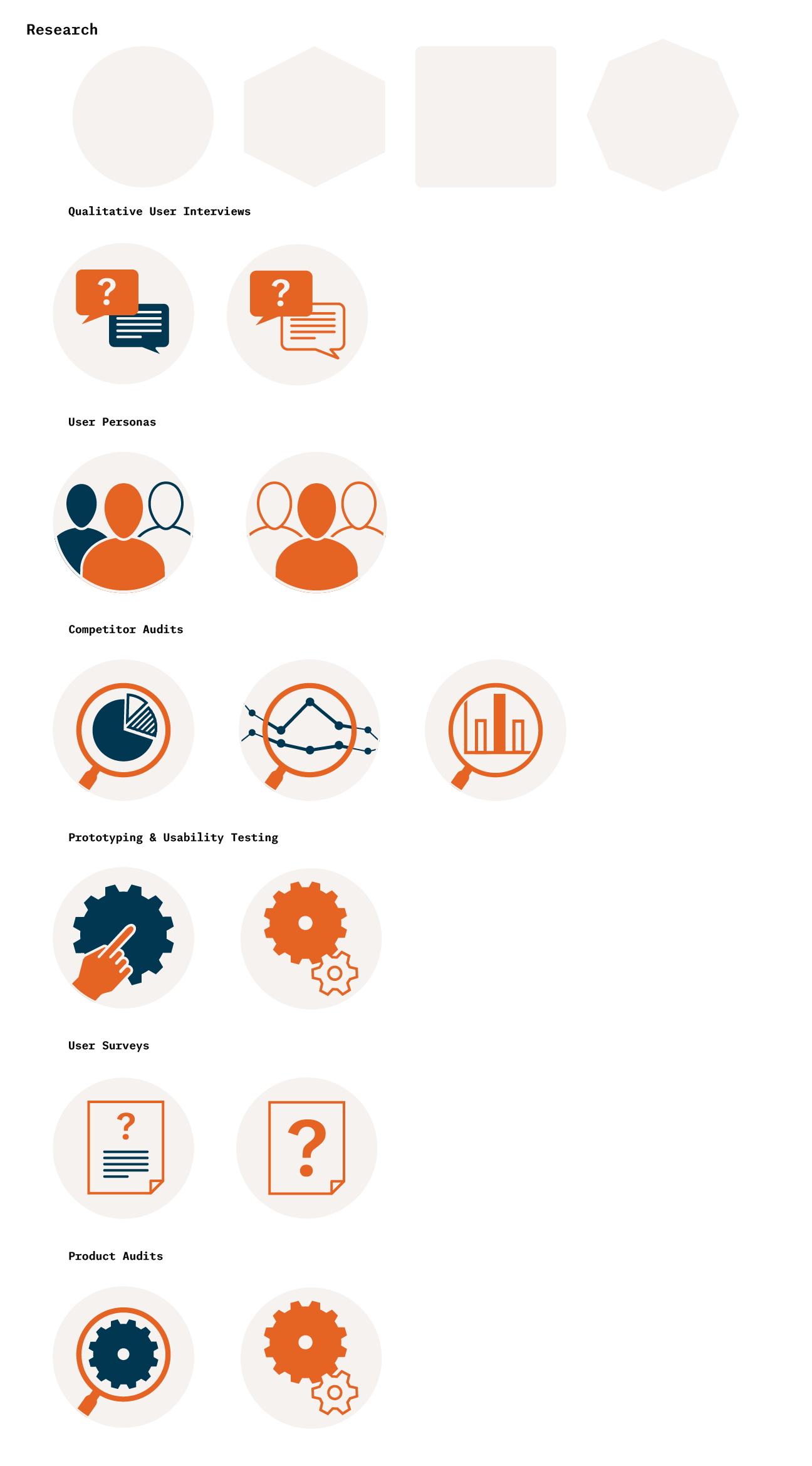
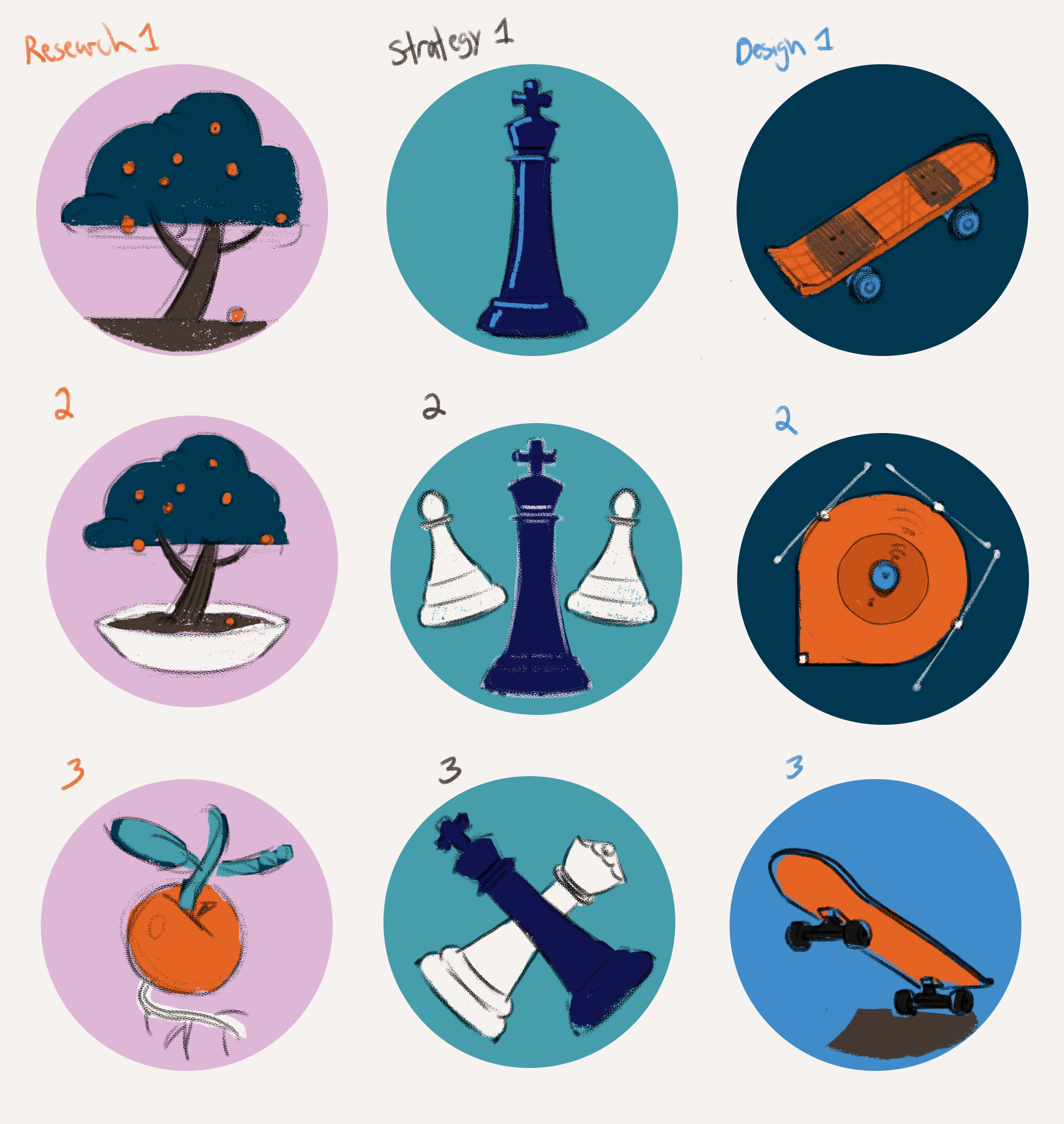
Sketches were done directly in Illustrator to keep vector shapes simple, and to allow for easy iteration on shapes in different icons.
The palette was limited to three colors, but that still left room for exploration with line and shape fills.
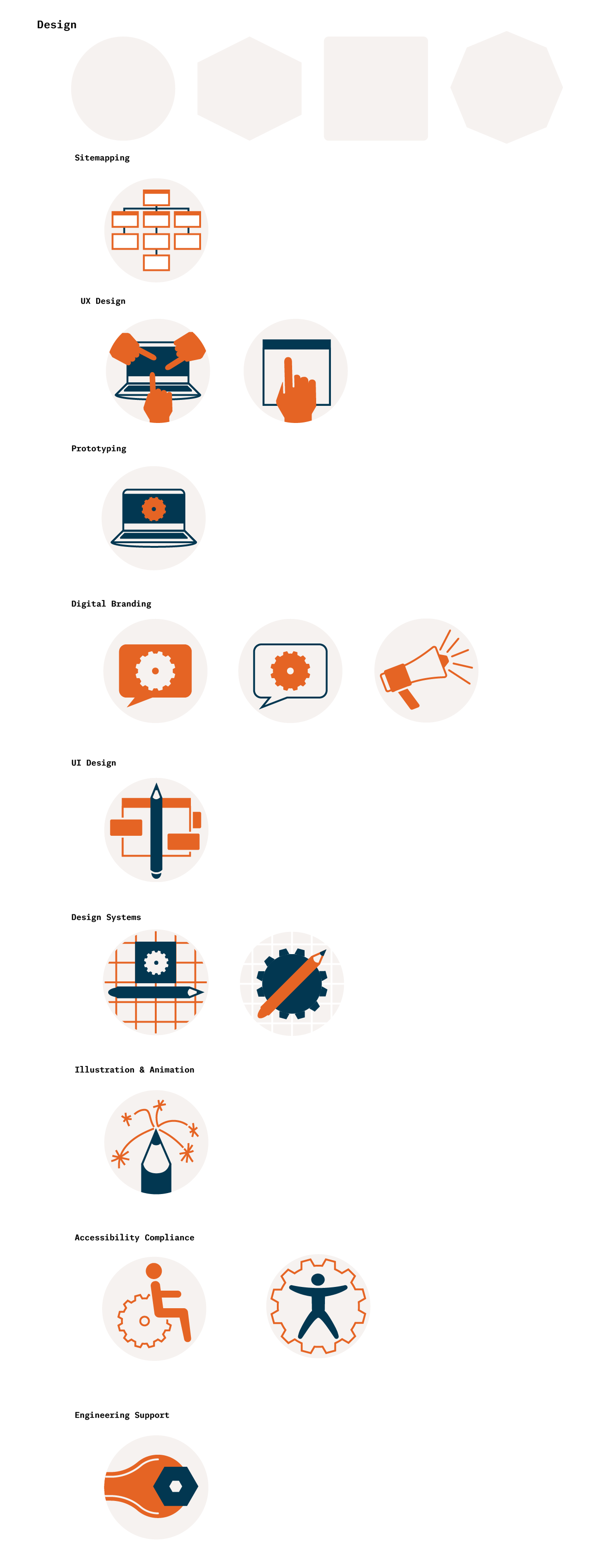
The icons needed to be universal, and maintain a unified visual language to work well as a group of images.
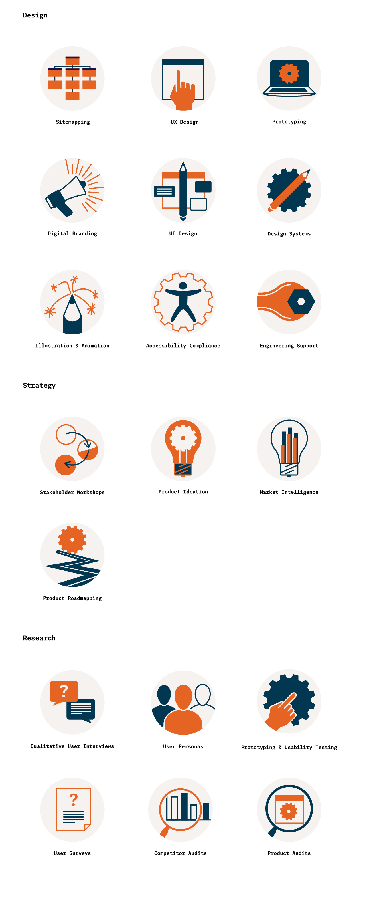
These are the final icon sets for each service area. The gears, hands and windows became a repeated motif through the final icons.
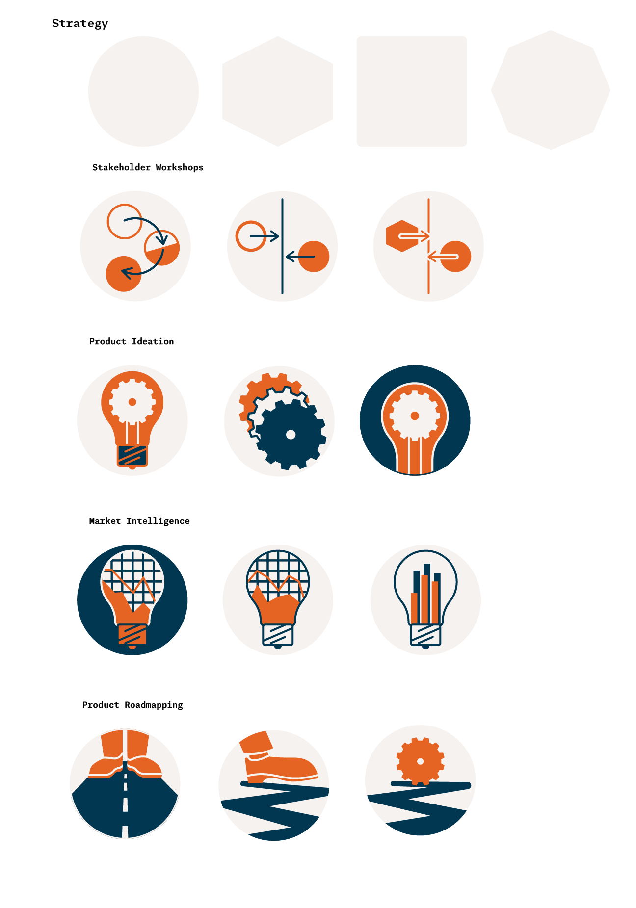
These icons where "Hero Icons" that would display larger than the previous set. These would link to corresponding pages with matching Headers, so the icons needed to reference the page they linked to.

For these icons I used a constrained version of the larger brand color palette, keeping them to 4 colors.

Textural gradients where incorporated to elevate this set from the flat colors of the simpler navigation icons.
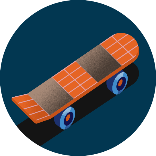
The client requested that all of these icons have a strong black element, to anchor them to a ground plan, and give the image more power.
Headers
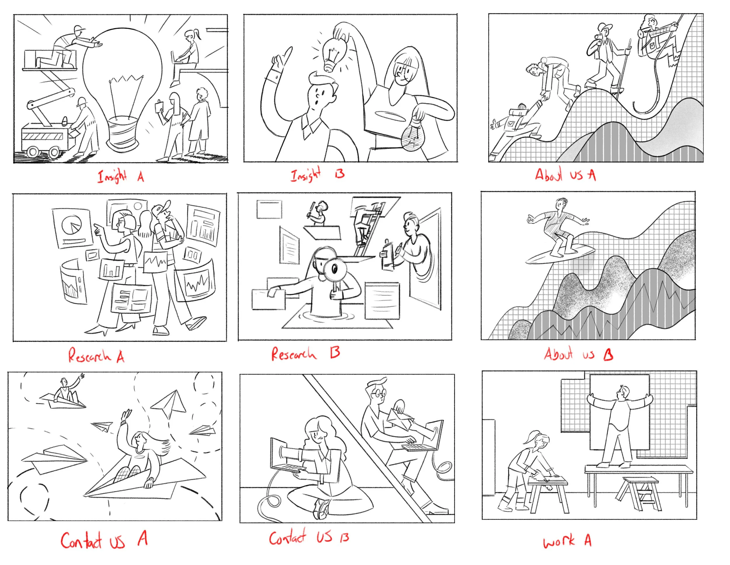
Sketches for "Hero" header images. I had worked on previous header images for the client, so I was already familiar with the tone, and aesthetics for these images.
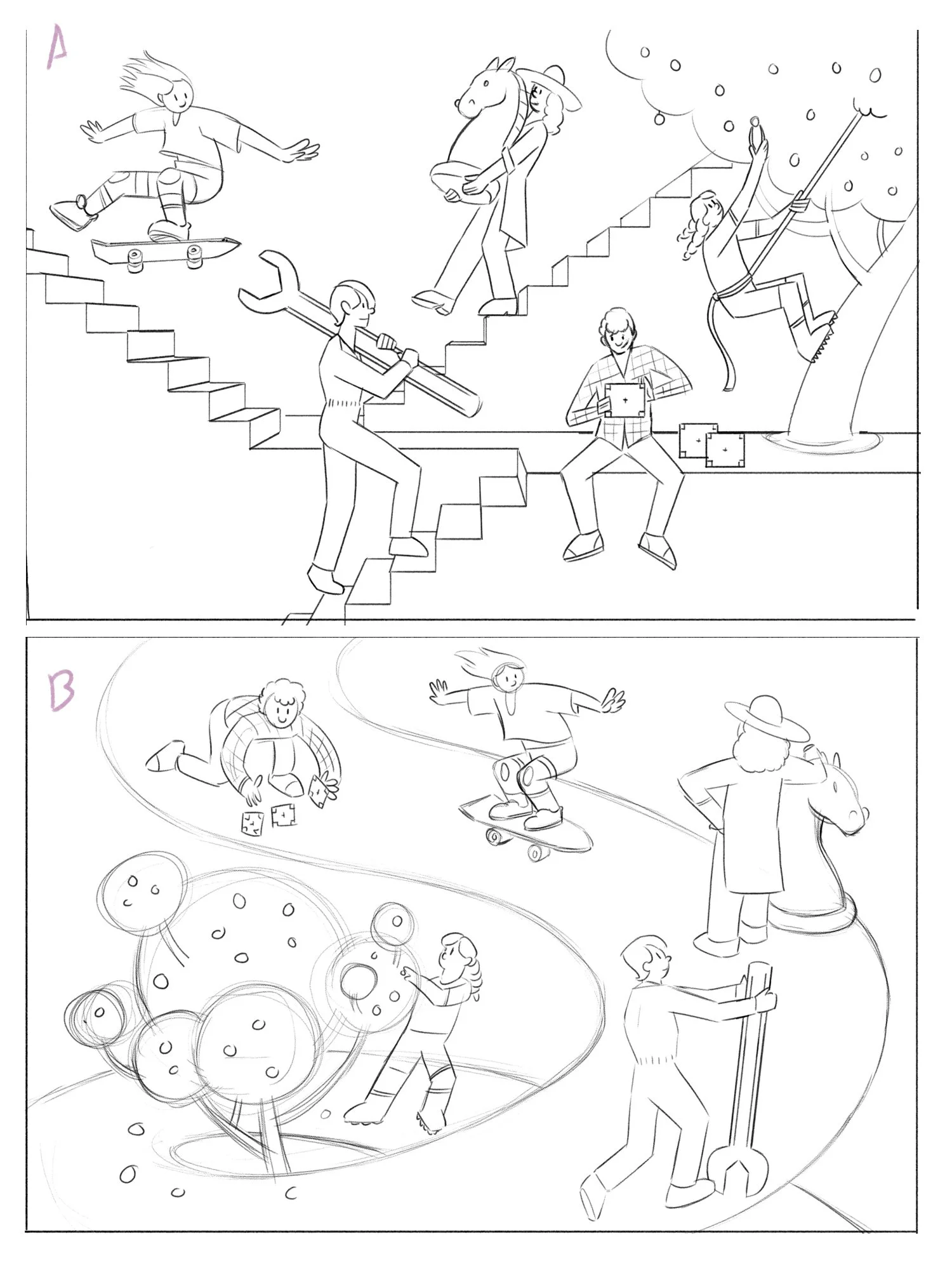
I wanted to incorporate visual themes the client was already using on their site. These include the fruit tree, chess pieces, light bulbs and skateboards.
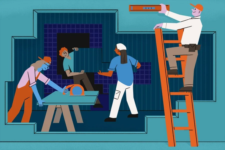
It was important to give the characters active poses, and to maintain the feeling of engagement throughout the header images.
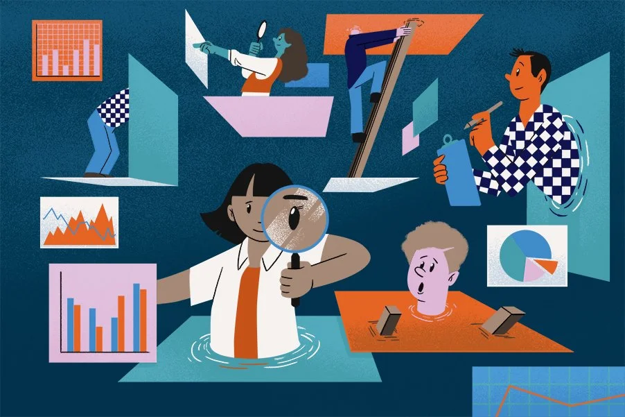
The client found the charts and graphs in this image very appealing, and asked that these elements be introduced is several of the other images.
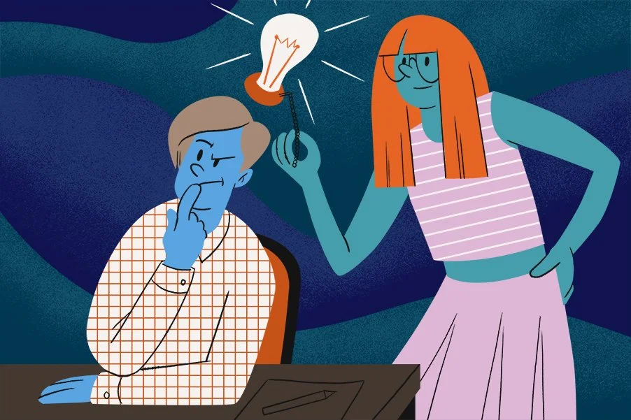
Patterns like pin stripes and grid are used as a repeating visual element through all the designs.
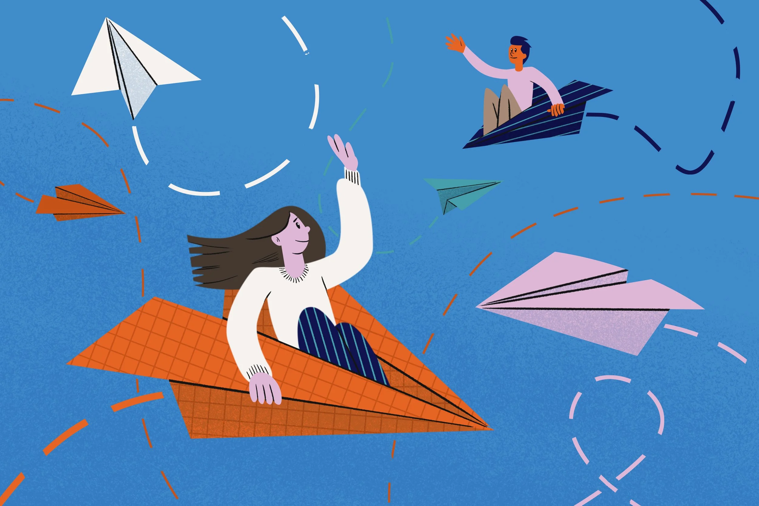
The paper plane was a slightly contentious object to use. The client was afraid that it had some negative connotations (like slacking off), but ultimately felt it worked for their Contact Us header.
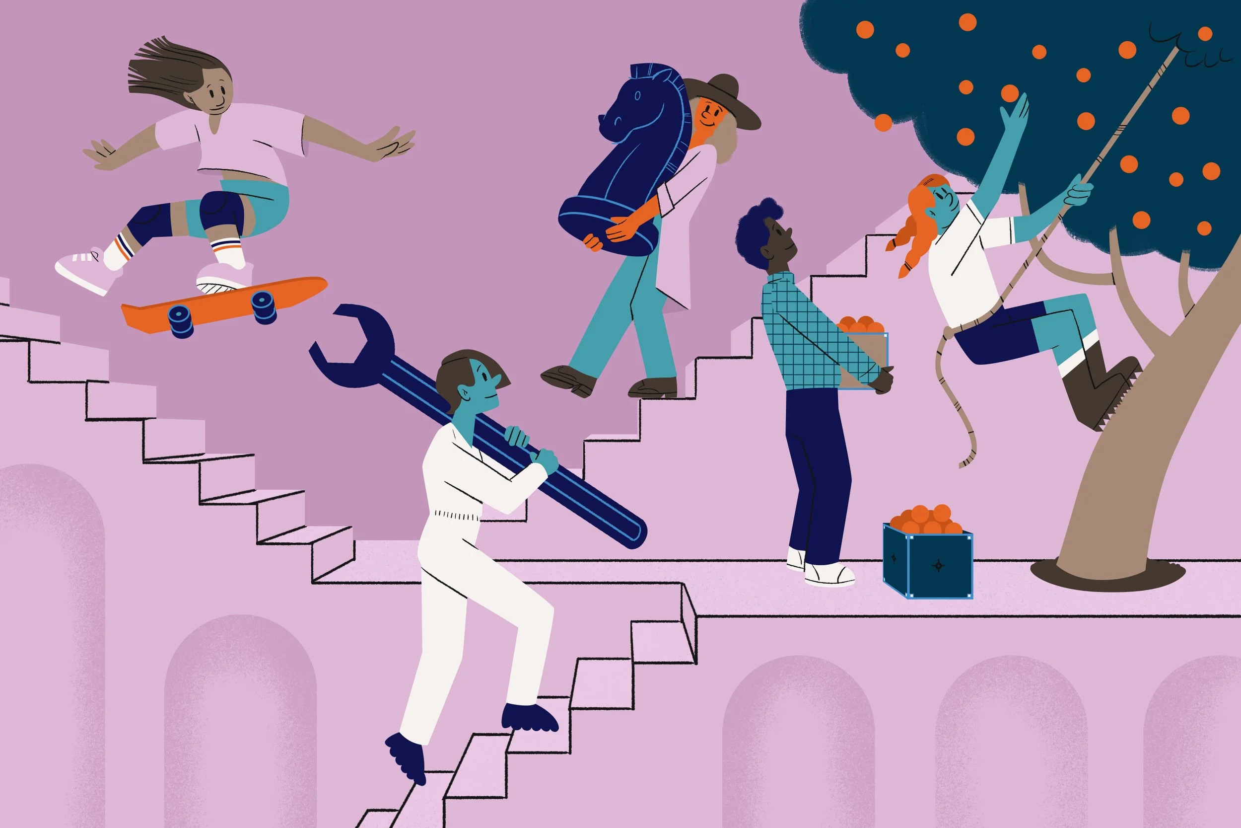
This image combines several characters from different call to action pages that were already live on the site.
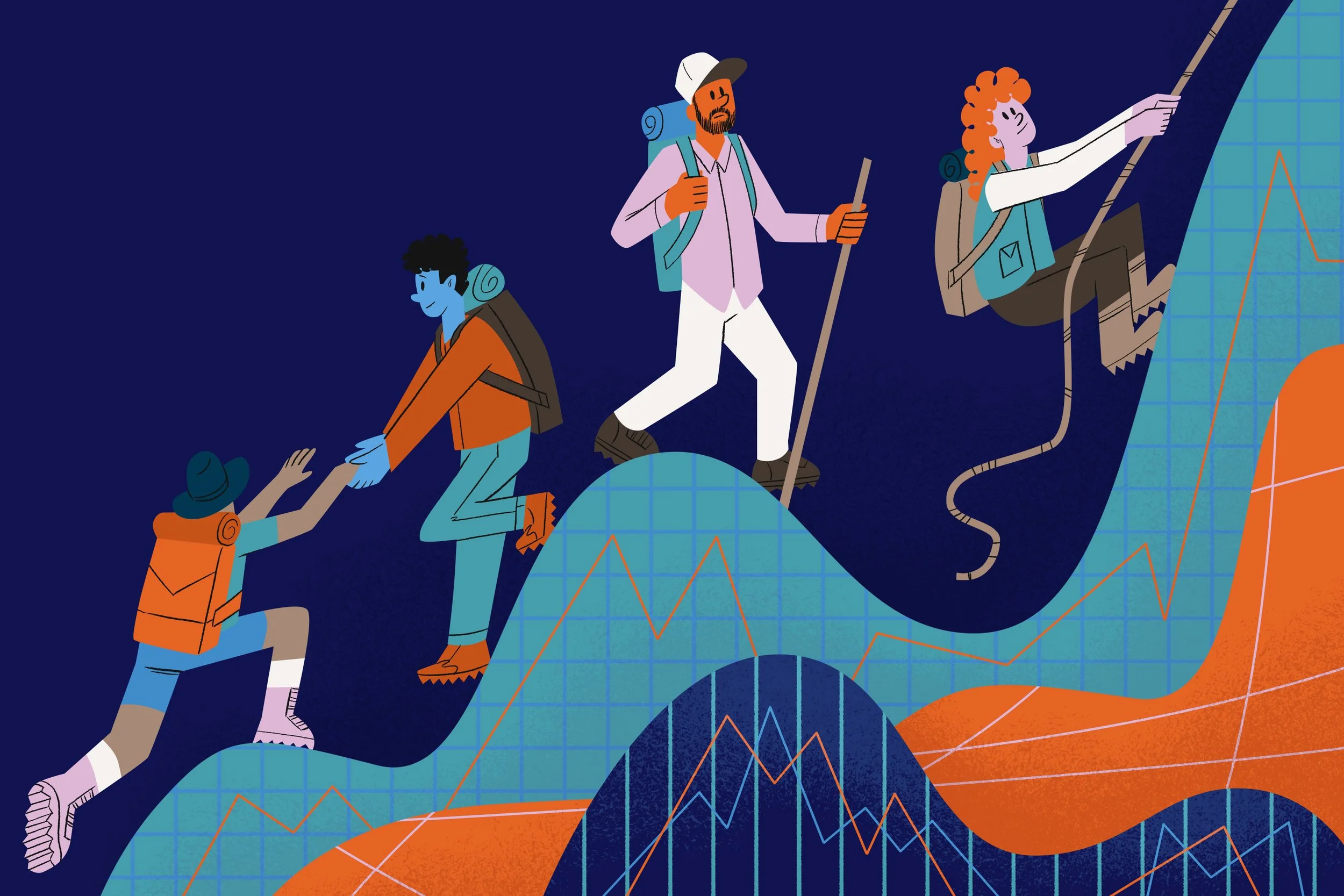
The waves or hills are a motif the client was already incorporating into some of their work. It has since become part of their company brand.
Animations
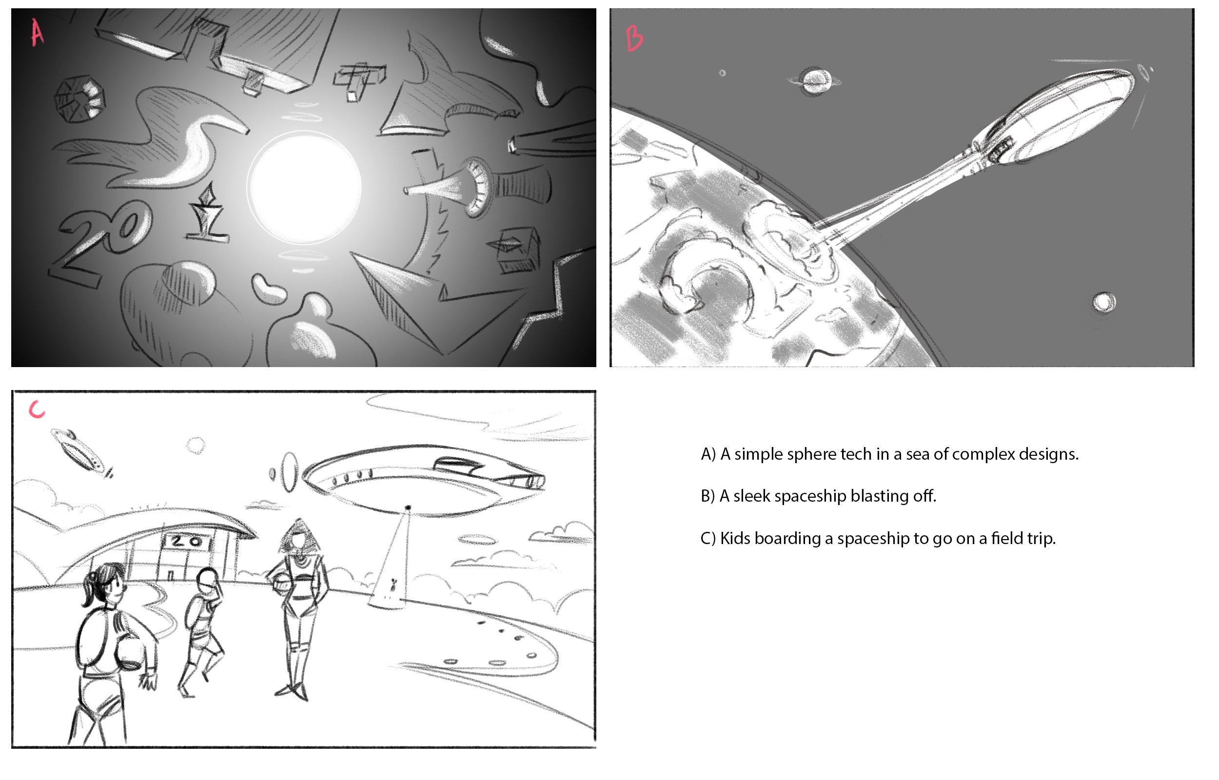
Principle: "We believe in the power of good design. It allows you to explain things in a way that is powerful and memorable. It's not just a nice-to-have, it's a must-have."
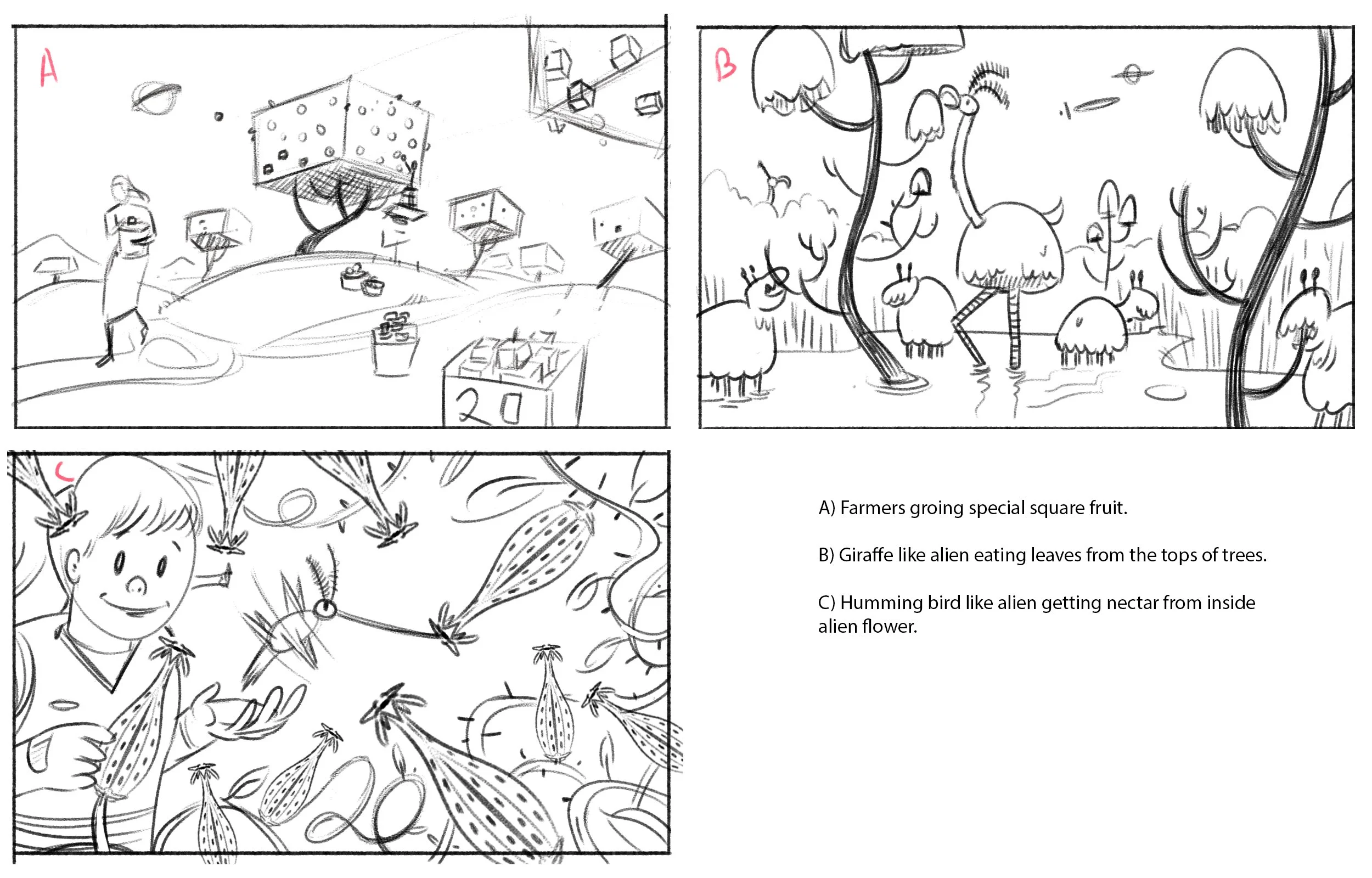
Principle: Specialization helps you make an impact
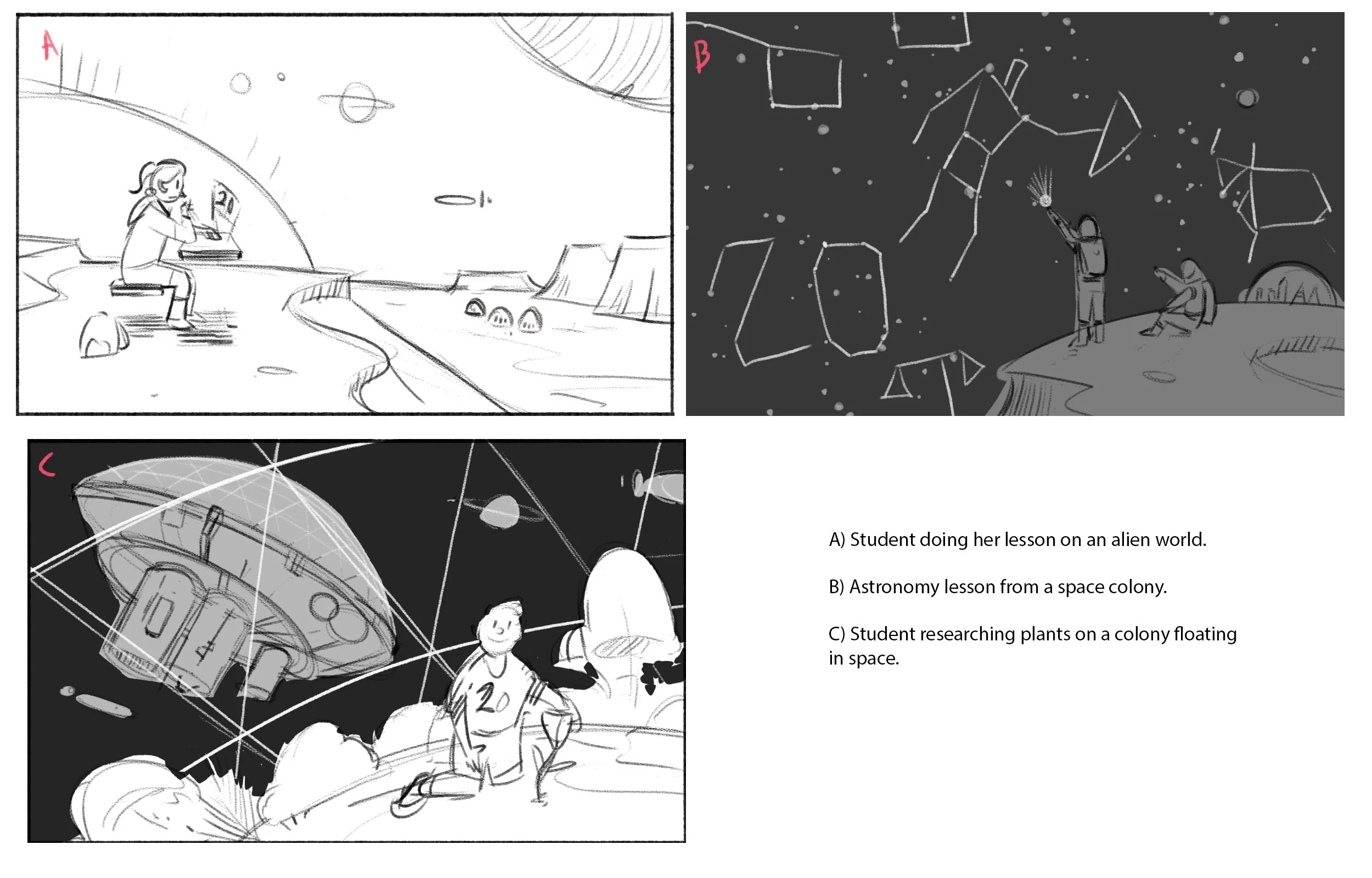
Principle: The best EdTech is used anywhere — not just in classrooms (the principles of what makes something a great learning experience + technology = learning can happen anywhere)
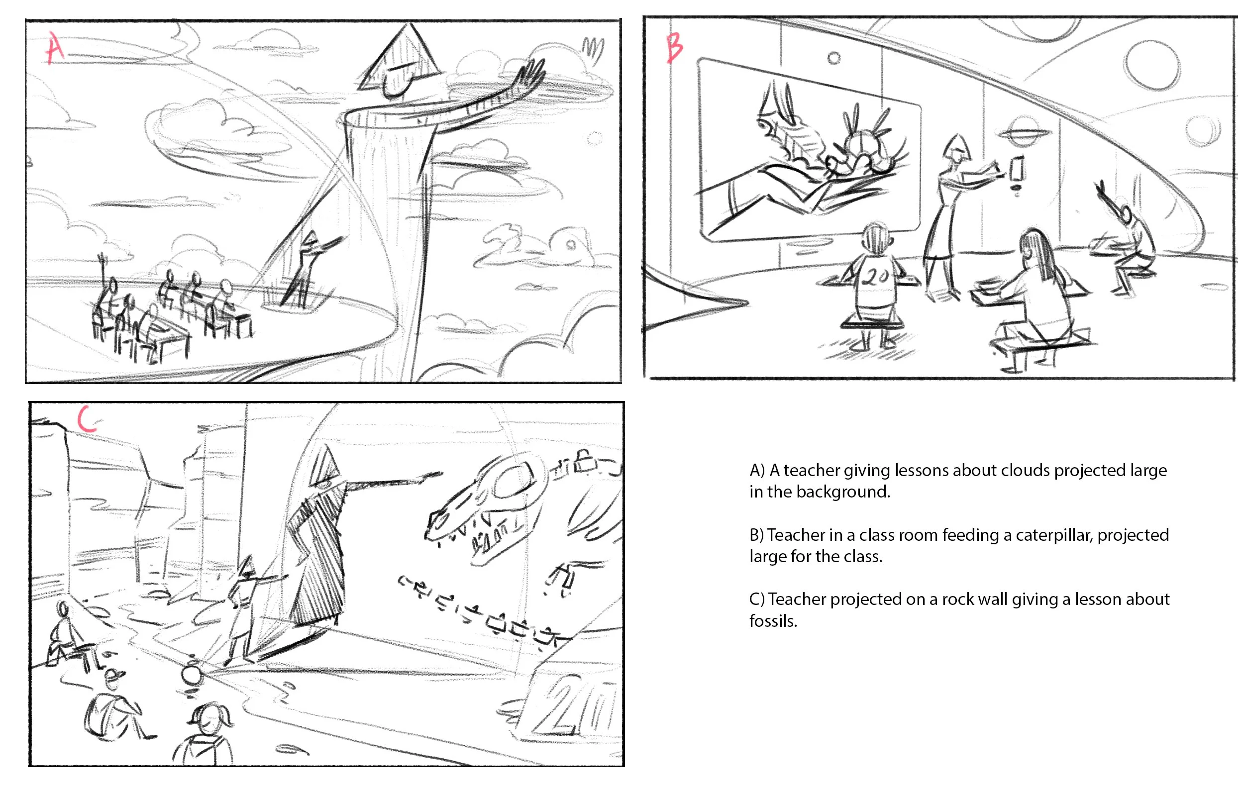
Principle: The best EdTech amplifies teachers — it doesn't replace them
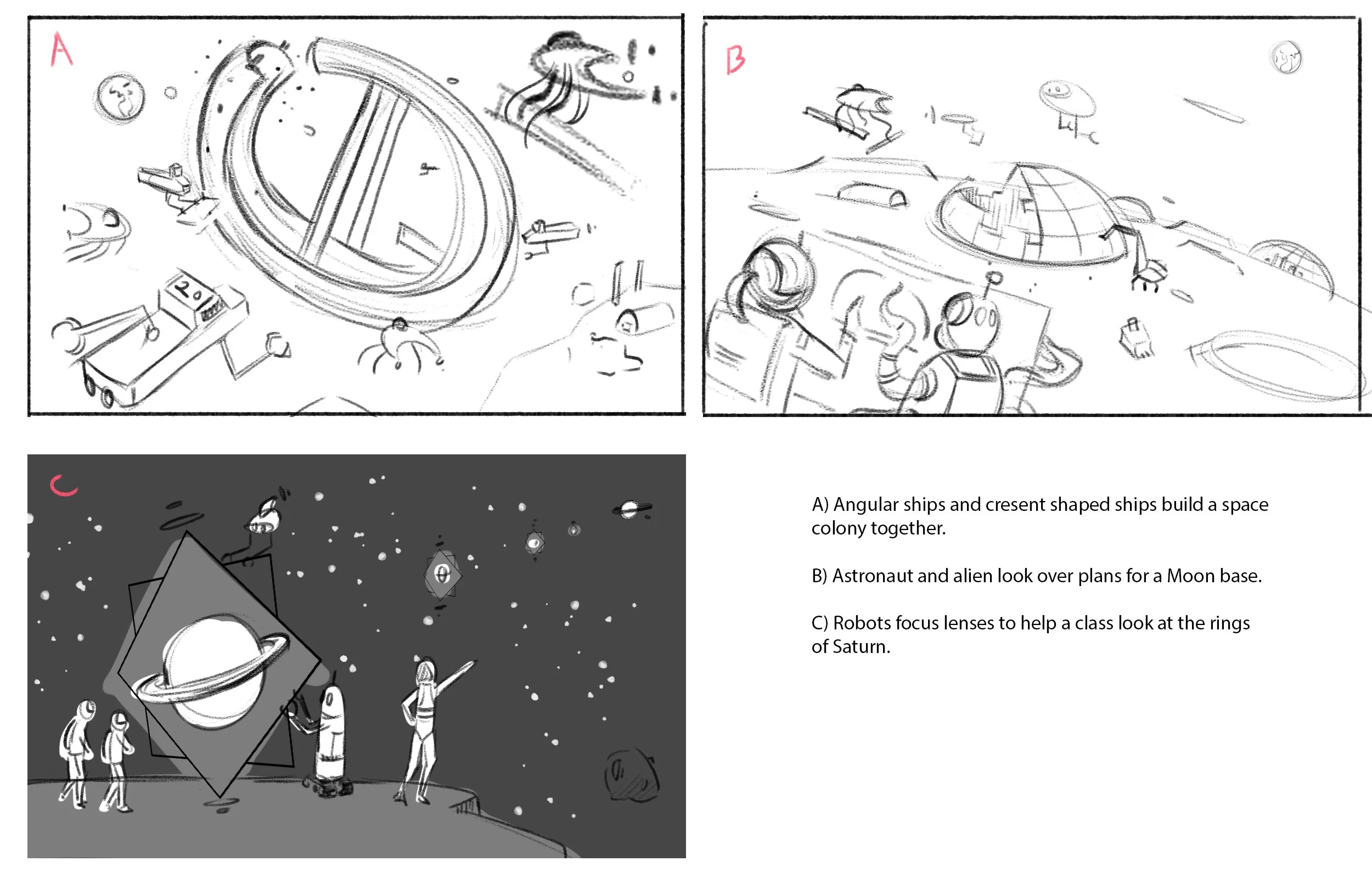
Principle: Partnering with organizations that share a mission to make an impact on learning.
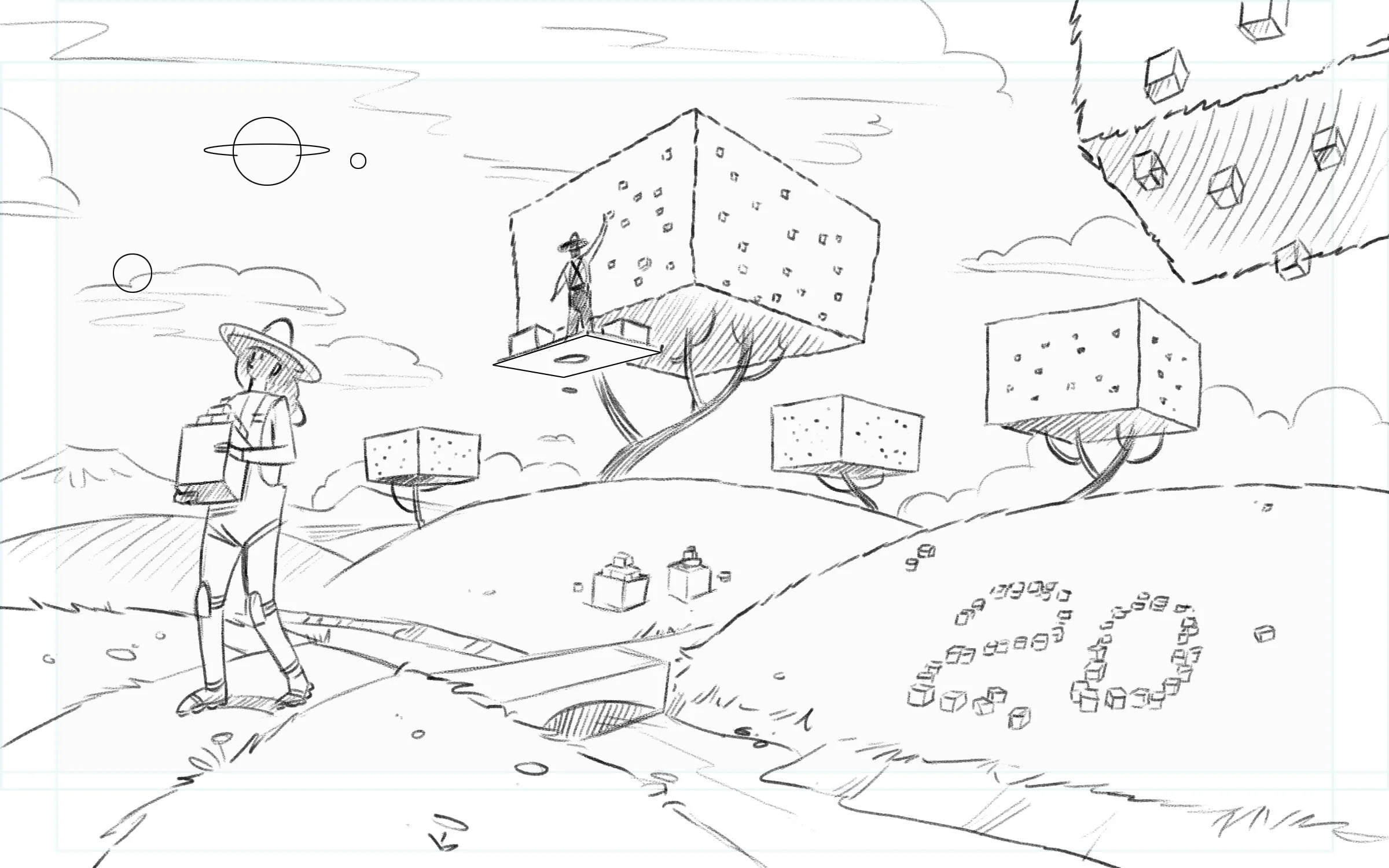
After the client chose which of the initial sketches worked best for the principle, I moved on to tighter sketches to finalize the look and feel.
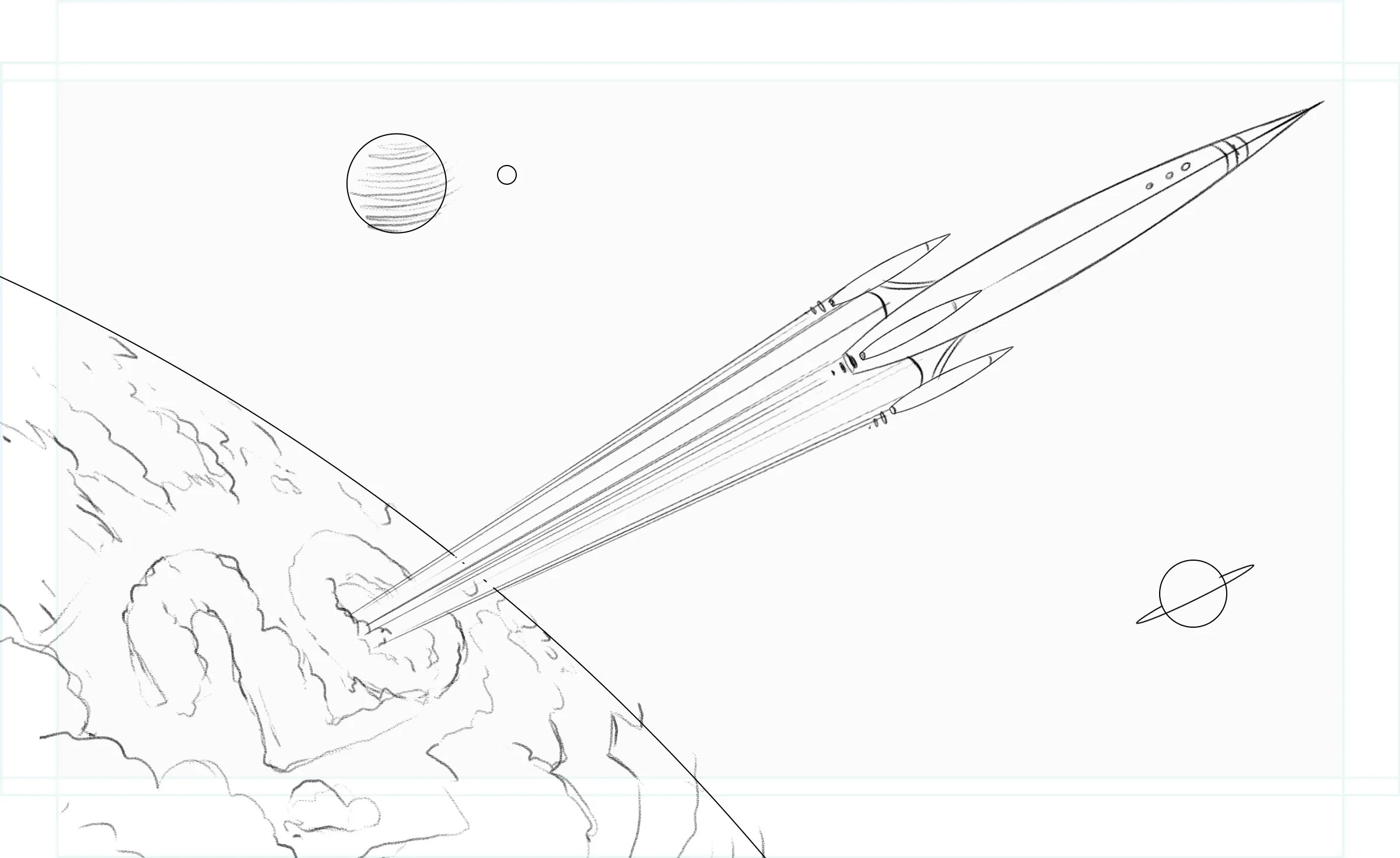
Each of the final animations needed to have 20 as an Easter egg referring to the 20th anniversary.
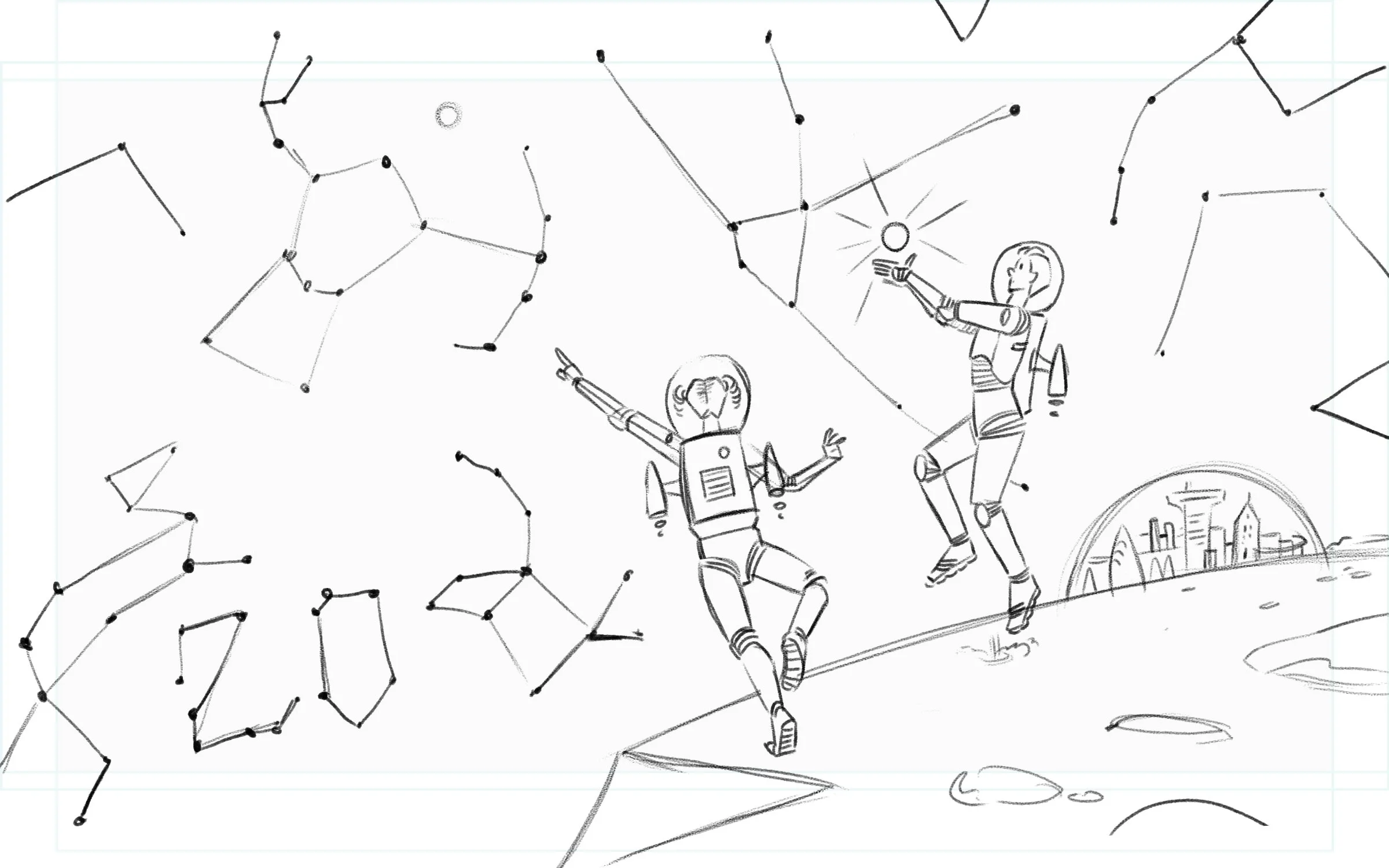
The animations need to work as static images in case they encountered trouble during the play back. The compositions were planned for the eventual social media crops.
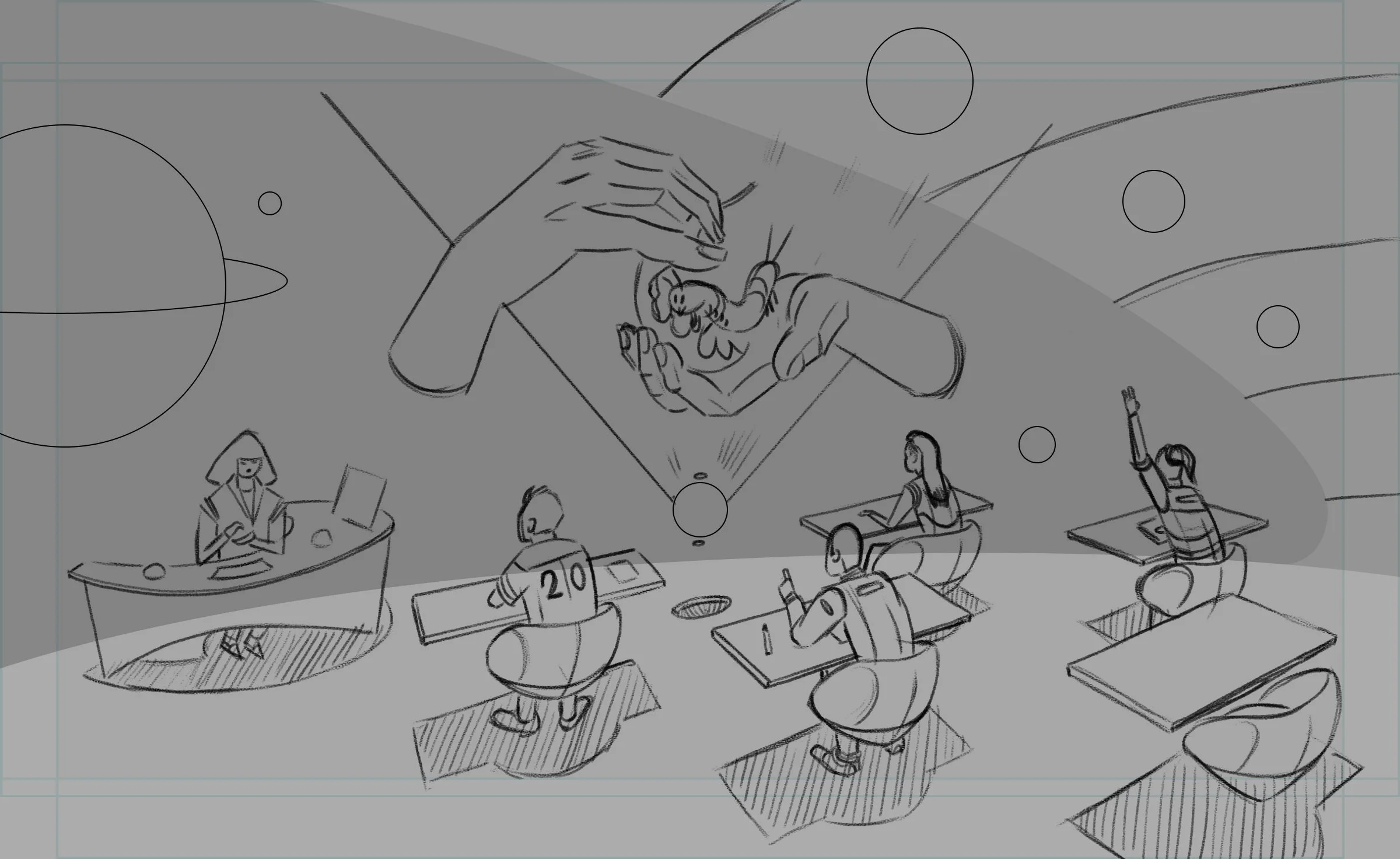
The client was looking for a retro-futurist aesthetic for these pieces. An optimistic view of what the future holds, while staying grounded in tradition.
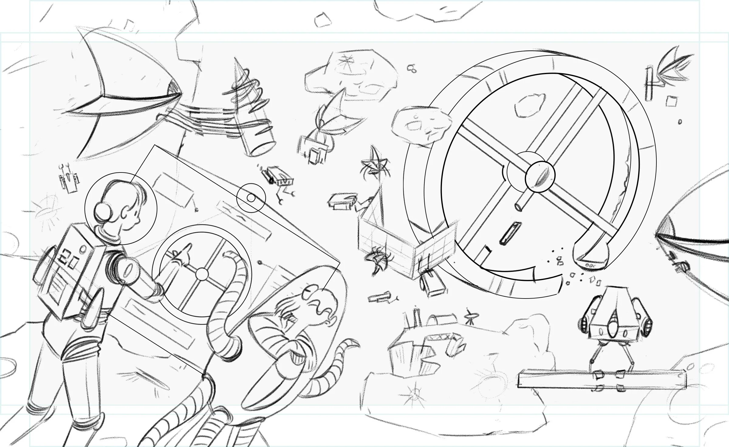
The animation was planned in this phase. All moving pieces where designed and their motion plotted before final art was made.
The final animations where designed to work as loops so there wouldn't be any cuts when animation restarted. Most of the animations a less then 5 seconds.
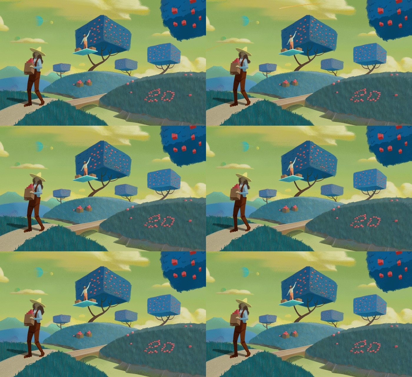
The animated assets where illustrated in Photoshop, and then composed and animated in After Effects.

While the main movement is important (in this case the light tracing a constellation) the subtle movements, like the astronaut's bounce and his shadow movement really sell the scene.
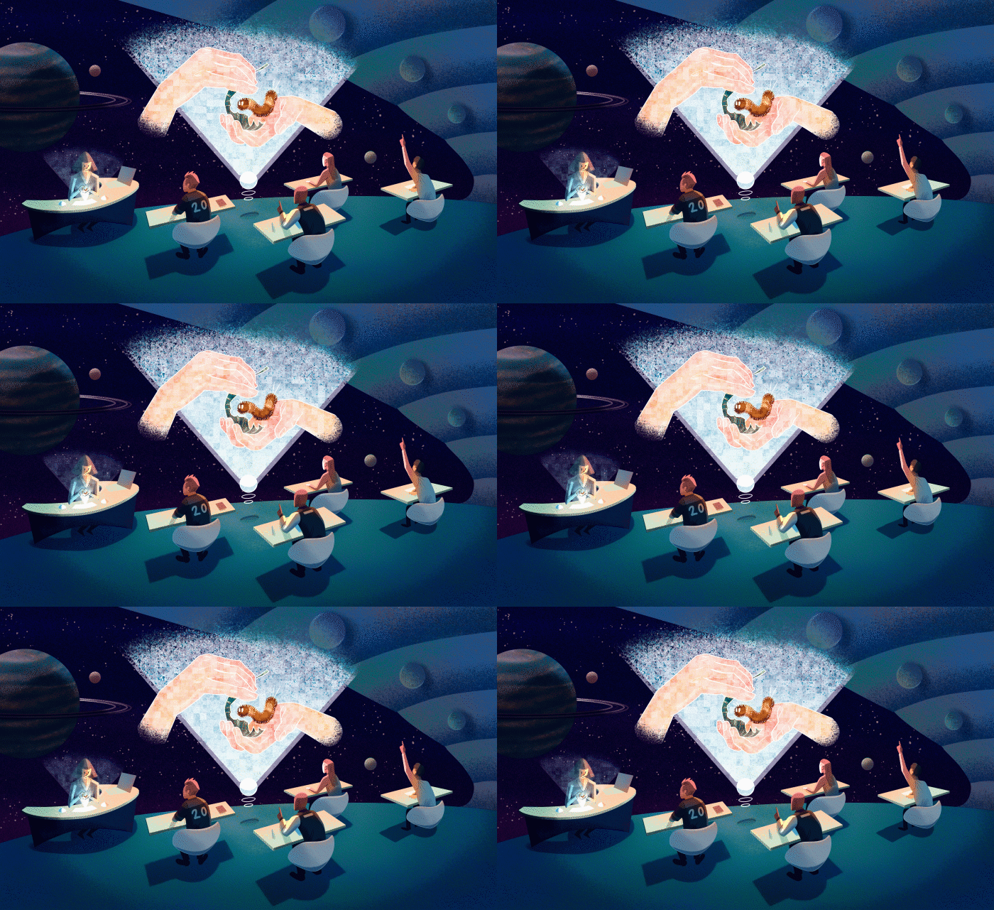
The most fantastical aspect of this image isn't the futuristic projector, its a classroom of only four students.

This was the most complex animation due to the shear number of moving pieces and effects, but the final result was well worth the effort.